The two graphs below depict the same journey along a straight road.
- What’s the same and what’s different about the graphs?
- What do you think the labels on the each of the axes would be?


Initial ideas might have been a distance-time graph and a speed-time graph. If this were true, would it be possible for them to represent the same journey? How would a constant speed be represented on each?
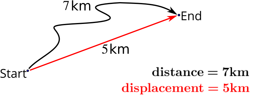
If we think only about distance, we should notice that the two graphs cannot both be distance-time graphs. Distance can only go on increasing; you cannot undo the distance you have travelled. The left hand graph is a distance-time graph, but the right hand graph is something else, in this case a displacement-time graph.
If we compare the graphs, then from \(0\) to \(10\) on the \(x\) axis, our graphs are identical. After this, they differ.
- What do you think changes in the journey after this point?
- What do you notice about the gradients of the same section on each graph?
To use the same graphs to explore further graphical representations of journeys, go to Speed vs velocity.


