Graphs

Hopefully you have now sketched graphs for some of the nine processes described in the previous section. What features did you consider as you did this?

Below is a possible graph for each process (but they’re muddled up). Can you match a graph to each process?

How do the graphs below compare to those you sketched? If you sketched something different, can you identify the assumptions that you made and those that might have led to the graphs below?

Bell shaped curve with positive y-intercept and maximum around x=200
Increasing function with increasing gradient and passing through the origin
Wave oscillating about the x-axis with decreasing amplitude as x increases.
Increasing function with rapidly increasing gradient and with small positive y-intercept
Increasing function with rapidly decreasing gradient and passing through the origin
Wave always taking positive values
Decreasing curve with y-intercept at 500 and tending towards 0 as x tends to positive infinity
S shaped curve starting at a small positive intercept and plateauing at 100000 when x=5
The shape of the curve is similar to the shape of 1 over x

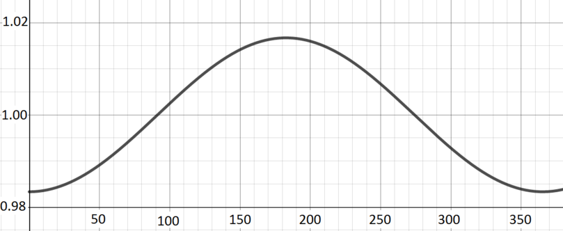
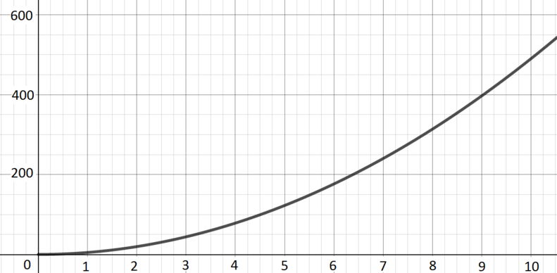
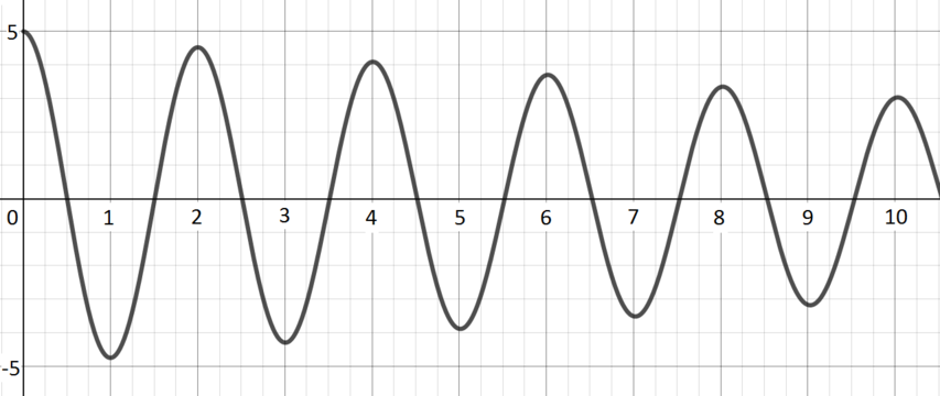
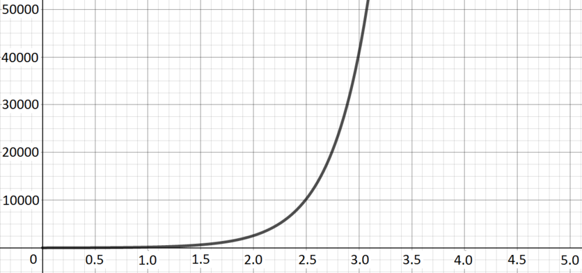
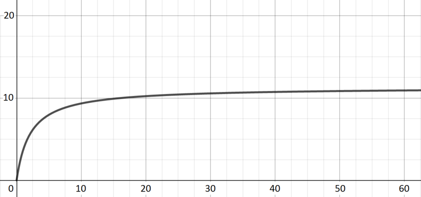
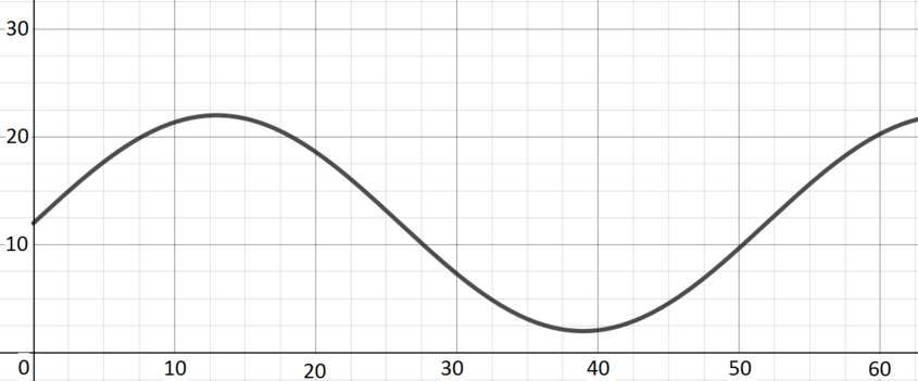
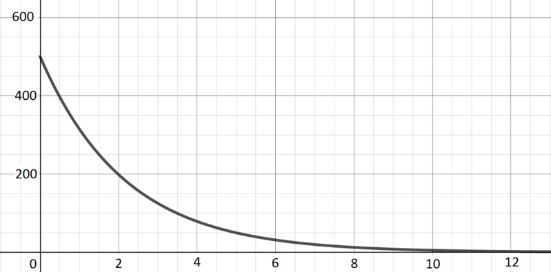
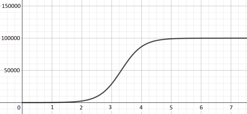
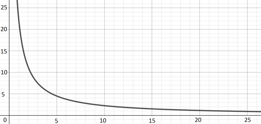
Hopefully you have now matched a graph to each process.

Can you suggest an equation for each process/graph pair?