In the first way of sorting the graphs, I started by identifying a single property and used this to divide the graphs into two families, then I sorted these families into further sub-families. Here is a different process that led to another way of sorting the graphs. You might find it helpful to have the graphs in front of you as you read this.
Identifying properties
I started by looking for features of the graphs and noticed that many graphs show functions with stationary points. I also noticed that several graphs show increasing functions, but at least one shows a decreasing function. The graphs were grouped into overlapping families according to these properties.
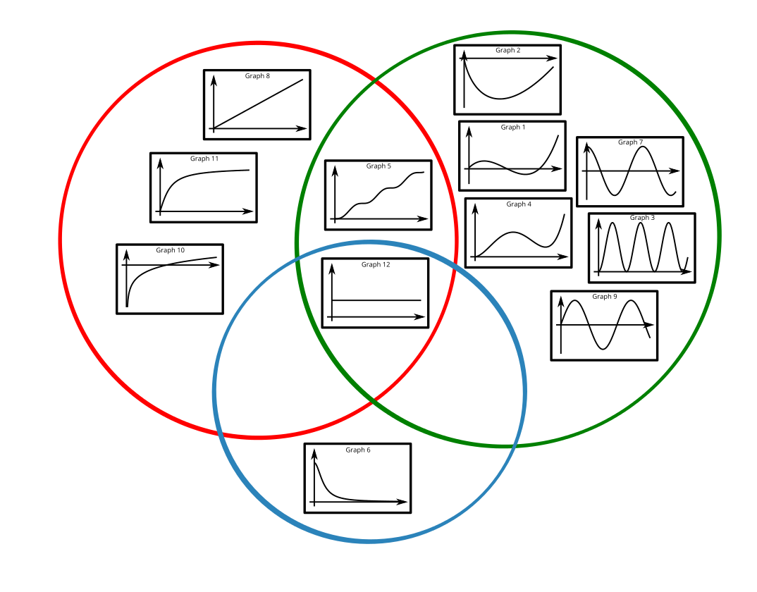
Can you explain why the graphs have been placed in these regions?
Can you think of graphs that would lie in the three empty regions?